Pick up your phone and search for anything. That small screen is now where most search happens.
It is also where Google judges your website. Google ranks pages based on their mobile version, not their desktop version. If your mobile site falls short, your rankings fall with it.
Mobile SEO is no longer a nice extra. It is the foundation of modern SEO.
In this guide, the SEO team at 4P Wisdom shares the mobile SEO best practices that matter in 2026. You will learn how Google evaluates mobile pages and how to fix common problems. You will also learn how to test your site and win more mobile traffic, calls, and customers.
What Is Mobile SEO?
Mobile SEO is the process of optimizing your website for search visibility and user experience on smartphones and tablets.
It covers how your site looks, loads, and works on small screens. It also covers how search engines crawl and index the mobile version of your pages.
Good mobile SEO helps visitors find answers quickly. It helps them tap, scroll, and buy without frustration. And it helps search engines understand and rank your content.
Mobile SEO vs Desktop SEO
The core principles stay the same. Great content, clean code, and strong links matter everywhere.
The difference lies in context. Mobile users have smaller screens, touch controls, and often slower connections. They also search on the move, often with local or urgent intent.
Mobile SEO adapts your site to those realities.
Why Mobile SEO Matters in 2026
Mobile is no longer the second screen. For most businesses, it is the first.
Most Web Traffic Comes From Mobile
Around 60% of global web traffic now comes from mobile devices, according to StatCounter. For local and service businesses, that share is often even higher.
If your mobile experience is weak, you lose most of your potential visitors.
Google Uses Mobile-First Indexing for Every Site
Google now crawls and indexes websites mainly with its smartphone crawler, called Googlebot Smartphone.
Google completed its move to mobile first indexing in 2024. Sites that do not work on mobile devices may struggle to get indexed at all.
In simple terms, your mobile site is your real site in Google’s eyes. Read Google’s official mobile-first indexing guide for the full details.
Mobile Search Results Are More Crowded
Mobile results pages now include AI Overviews, local packs, videos, and product carousels. These features push regular results further down the screen.
Strong mobile SEO helps you compete for the limited space that remains.
Mobile Users Convert Fast or Leave Fast
Mobile visitors are impatient. A slow page or awkward button sends them straight back to the results.
A smooth mobile experience improves engagement, leads, and sales.
How Google Evaluates Mobile Pages
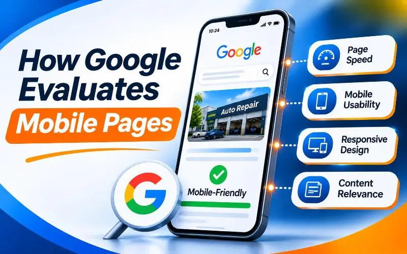
Understanding how Google reviews mobile pages helps you focus on what matters.
Googlebot Smartphone
Googlebot Smartphone visits your pages like a modern Android phone. It downloads your HTML, renders the page, and stores what it finds.
Anything missing from your mobile version may be missing from Google’s index.
Content Parity
Content parity means your mobile and desktop pages contain the same important content. Google expects them to match.
If your mobile page hides text, images, or links, Google may never see them.
Page Experience Signals
Google’s page experience guidance lists several signals. These include Core Web Vitals, HTTPS, and the absence of intrusive interstitials.
These signals support rankings, but they never replace helpful, relevant content.
Important Tools Google Retired
Many older guides recommend tools that no longer exist.
Google retired the Mobile Friendly Test in December 2023. It also removed the Mobile Usability report from Search Console at the same time.
Today, you test mobile pages with Lighthouse, PageSpeed Insights, and URL Inspection. We cover each one later in this guide.
Choose the Right Mobile Configuration
How you build your mobile site shapes everything else. There are three main options.
Responsive Web Design (Recommended)
Responsive design serves the same HTML and URL to every device. CSS adjusts the layout to fit each screen size.
Google recommends responsive design as the easiest pattern to implement and maintain. It avoids duplicate content, extra redirects, and separate crawling.
For most businesses, responsive design is the clear choice. Our responsive web design services build sites that perform well on every screen.
Dynamic Serving
Dynamic serving uses the same URL but sends different HTML based on the device.
It can work, but it adds risk. The server may detect devices incorrectly. You also need a Vary HTTP header that tells caches the content changes by user agent.
Separate Mobile URLs (M Dot Sites)
Some older sites use a separate mobile subdomain, such as m.example.com. Each page has two URLs, one for desktop and one for mobile.
This setup is the hardest to maintain. You need correct canonical and alternate tags on every page pair. You also need perfect redirects between versions.
If you still run an m dot site, consider moving to responsive design. Treat it as a migration and follow our website migration SEO checklist. Our comparison of subdirectory vs subdomain for SEO also explains why subdomains add complexity.
Mobile SEO Best Practices for 2026
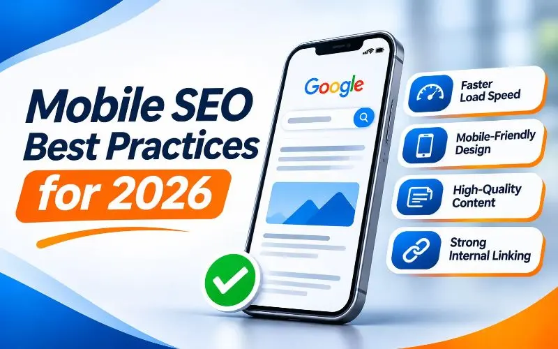
Here are the practices that make the biggest difference today. Work through them in order.
1. Keep Mobile and Desktop Content Identical
This is the most important mobile SEO rule. Your mobile pages should include everything important from your desktop pages.
Check that these elements match on both versions:
- Main text content and headings.
- Images, with the same alt text.
- Videos and their thumbnails.
- Internal links and navigation paths.
- Title tags and meta descriptions.
- Structured data.
- Robots meta tags and canonical tags.
Collapsed sections, tabs, and accordions are fine on mobile. Google indexes that content as long as it exists in the page code.
Problems start when content is removed from mobile entirely. Some themes cut sidebars, footers, or menu links on small screens. That can break your internal linking strategy.
2. Set the Viewport Meta Tag Correctly
The viewport meta tag tells browsers how to size your page on mobile screens. Without it, phones display a tiny desktop layout.
Set the viewport width to match the device width, with an initial scale of one. Most modern themes include this tag automatically.
Avoid disabling user zoom. Blocking zoom hurts accessibility for people with low vision.
3. Make Mobile Pages Load Fast
Mobile users often browse on slower networks and less powerful devices. Speed matters even more on phones.
Focus on these quick wins:
- Compress images and serve modern formats like WebP or AVIF.
- Use responsive images, so phones download smaller files.
- Lazy load images below the fold, but never your main hero image.
- Remove unused JavaScript and CSS.
- Use a content delivery network such as Cloudflare.
- Enable browser and server caching.
- Limit heavy third-party scripts like chat widgets and trackers.
Images often make up most of a mobile page’s weight. Learn how to balance visuals and speed and whether adding more pictures can improve SEO.
4. Pass Core Web Vitals on Mobile
Core Web Vitals measure real user experience. Google uses mobile field data from real Chrome users.
Aim for these targets at the 75th percentile of mobile visits:
- Largest Contentful Paint under 2.5 seconds.
- Interaction to Next Paint under 200 milliseconds.
- Cumulative Layout Shift under 0.1.
Interaction to Next Paint replaced First Input Delay in March 2024. Some older guides still mention the retired metric.
Mobile scores are usually worse than desktop scores. Always check the mobile tab first. Learn the details in our Core Web Vitals guide and Google’s Web Vitals overview.
5. Control JavaScript on Mobile
Heavy JavaScript hurts mobile performance more than desktop. Phone processors take longer to run scripts.
Large bundles slow down loading and responsiveness. They also make rendering harder for search engines and AI crawlers.
Keep critical content in the initial HTML. Split large scripts and defer anything not needed right away. Our guide to JavaScript rendering for SEO explains how.
6. Design for Thumbs, Not Mouse Pointers
Mobile users tap with their fingers. Small or crowded buttons cause mistakes and frustration.
Follow these touch design rules:
- Make tap targets at least 48 by 48 pixels.
- Leave space between buttons and links.
- Place key actions within easy thumb reach.
- Use sticky call or booking buttons for service businesses.
- Avoid hover effects that hide important information.
These small details make your site feel easy to use.
7. Use Readable Fonts and Clear Layouts
Text should be readable without zooming. Use a base font size of at least 16 pixels for body text.
Keep line spacing generous and paragraphs short. Use strong color contrast between text and background.
Avoid horizontal scrolling. Every element should fit within the screen width.
8. Write Mobile-Friendly Content
Writing for mobile is different from writing for desktop. Small screens make long blocks of text feel overwhelming.
Follow these content tips:
- Answer the main question in the first few lines.
- Keep paragraphs to two or three short sentences.
- Use descriptive subheadings so readers can skim.
- Use numbered lists for steps and comparisons.
- Add images or videos to break up long sections.
Clear, structured content also helps AI tools pull accurate answers from your pages.
9. Avoid Intrusive Interstitials
Popups that cover content frustrate mobile users. Google treats intrusive interstitials as a poor page experience.
Avoid full-screen popups that appear right after a visitor lands. Avoid layouts where visitors must close a popup before reading.
Legal notices, cookie banners, and age checks are acceptable when required. Small banners that use a reasonable amount of space are also fine.
Read Google’s guide to avoiding intrusive interstitials for clear examples.
10. Simplify Mobile Navigation
Mobile menus must be simple, clear, and crawlable.
Use a clean hamburger or bottom menu with your main categories. Keep important pages within a few taps of the homepage.
Make sure menu links use standard HTML anchor links. Links that load only after a JavaScript click may be invisible to crawlers.
Add breadcrumbs to help users and search engines understand where each page sits.
11. Optimize Titles and Meta Descriptions for Mobile Results
Mobile results show fewer characters before cutting off text. Put the most important words first.
Keep title tags around 50 to 60 characters. Keep meta descriptions short and direct, ideally around 120 characters.
Make every title unique and include your primary keyword naturally. Add a clear benefit or call to action in the description.
12. Use Structured Data on Mobile Pages
Structured data helps search engines understand your content. It can also make your results stand out with rich features like stars, prices, and breadcrumbs.
Make sure your mobile pages include the same structured data as desktop. This is a common gap on older m dot sites.
Learn how to add it correctly in our guide on what schema markup is and how to implement it.
13. Make Mobile Forms Easy to Complete
Forms are where many mobile conversions fail. Long, fiddly forms send visitors away.
Keep forms short, with only essential fields. Use the right input types, so phones show number pads for phone fields. Enable autofill wherever possible.
Make error messages clear and easy to fix. A single frustrating form can cost you a valuable lead.
14. Keep Your Site Crawlable on Mobile
Mobile crawling problems often hide in plain sight. Check that your robots.txt file does not block CSS, JavaScript, or images.
Googlebot Smartphone needs these files to render your mobile pages properly. Learn safe rules in our robots.txt guide.
Watch for other common crawlability problems, such as broken mobile links and redirect errors.
15. Make Your Mobile Site Accessible
Accessibility and mobile SEO go hand in hand. Both focus on making your site easy for everyone to use.
Use semantic HTML, clear headings, descriptive alt text, and strong color contrast. Support screen readers and allow users to zoom.
Follow the Web Content Accessibility Guidelines from the W3C. Then test your site using our guide on how to check website accessibility.
Mobile Local SEO: Win “Near Me” Searches
Mobile and local search are deeply connected. People search on their phones when they need something nearby, often right now.
Optimize Your Google Business Profile
Your Google Business Profile often appears before your website on mobile. It shows your hours, reviews, photos, and a direct call button.
Keep every detail accurate and complete. Add fresh photos, respond to reviews, and post updates regularly.
Our Google Business Profile optimization services handle this for busy business owners. You can also follow our Google Business Profile optimization checklist.
Add Click to Call and Directions
Make your phone number a clickable link on every mobile page. Add a clear “Get Directions” button that opens maps.
These features turn mobile searchers into calls and visits within seconds.
Build Mobile Friendly Contact and Location Pages
Your contact page should load fast and show key details immediately. Include your address, phone number, hours, and an embedded map.
Learn how in our guide to building a high converting local contact us page.
Understand How Local Rankings Work
Google ranks local results using relevance, distance, and prominence. Mobile searchers often see results based on their exact location.
Learn more in our guide on how Google determines relevance, distance, and prominence. For the full strategy, read our local SEO guide.
Optimize for Voice, Visual, and AI Search on Mobile
Mobile search is no longer just typing. People speak, snap photos, and chat with AI.
Voice Search
Voice searches are longer and more conversational. People ask full questions, like “Where can I get my brakes fixed near me?”
Target question based keywords and answer them clearly. Our guide on how to do keyword research for local SEO shows how to find these phrases.
Visual Search With Google Lens and Circle to Search
Google Lens and Circle to Search let mobile users search with images. They can circle a product on screen and find where to buy it.
Use high quality, original images with descriptive file names and alt text. Add product structured data where relevant.
Google now reports some of this activity in Search Console. Learn more in our article on how Search Console added multimodal search reporting.
AI Overviews and AI Mode
AI Overviews often fill a large part of the mobile screen. Earning a citation there can put your brand at the top.
Write clear, direct answers. Structure content with helpful headings and lists. Keep your facts accurate and up to date.
Read our guide on how to rank in Google’s AI Overviews. Service businesses should also see how to win with AI search SEO.
How to Test Your Mobile SEO
Testing shows you what users and search engines actually experience. Use a mix of these tools.
Google PageSpeed Insights
PageSpeed Insights shows real user data and lab data for any URL. Always start with the mobile tab.
Review Core Web Vitals, then work through the suggested improvements.
Google Search Console
Open Google Search Console and check the Core Web Vitals report. It groups mobile URLs as good, needing improvement, or poor.
Use the URL Inspection tool to see how Googlebot Smartphone renders any page. Check the screenshot and rendered HTML for missing content.
Lighthouse and Chrome DevTools
Lighthouse runs inside Chrome and audits performance, accessibility, and SEO. It flags small fonts, tiny tap targets, and missing viewport tags.
Chrome DevTools also includes Device Mode. It simulates different phones, screen sizes, and slower networks.
Chrome User Experience Report
The Chrome User Experience Report collects real performance data from Chrome users. It powers the field data in PageSpeed Insights and Search Console.
Test on Real Phones
Emulators are helpful, but real devices reveal more. Test on at least one iPhone and one mid range Android phone.
Try key tasks yourself. Search for a service, tap through menus, fill out a form, and call your business.
Site Crawlers
Tools like Screaming Frog, Semrush, and Ahrefs can crawl your site as a smartphone. Use them to compare mobile and desktop content, links, and tags at scale.
How to Measure Mobile SEO Performance
Track results so you know your work is paying off.
Compare Devices in Search Console
In the Performance report, use the Devices tab. Compare clicks, impressions, click through rate, and average position for mobile and desktop.
A big gap between them often reveals mobile specific problems.
Compare Devices in Google Analytics 4
In GA4, compare mobile and desktop engagement and conversions. Look for pages with high mobile traffic but weak mobile conversions.
These pages usually need better speed, layout, or forms.
Track Mobile Rankings Separately
Mobile and desktop rankings can differ, especially for local searches. Use a rank tracker that supports mobile results and local positions.
For a complete reporting framework, see our guide to SEO KPIs for organic and AI search growth.
Common Mobile SEO Mistakes to Avoid
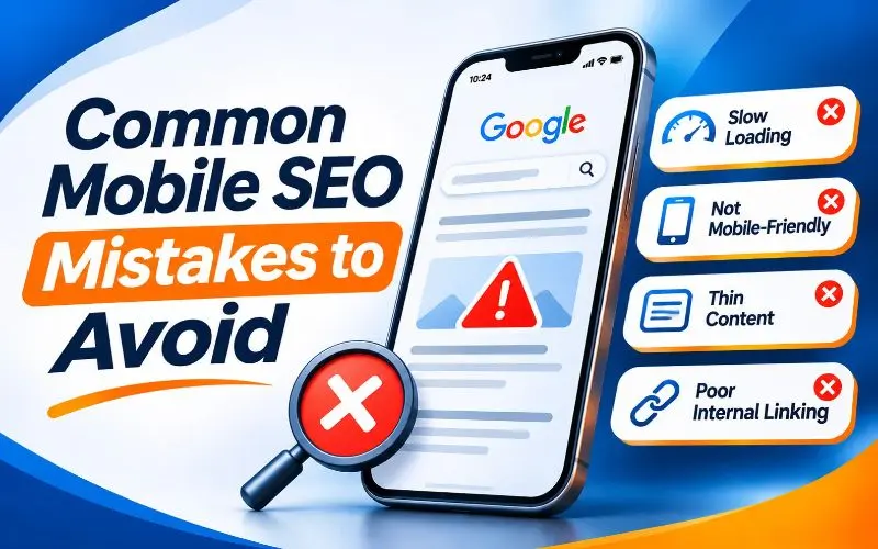
These mistakes appear again and again in our mobile audits.
- Removing content or links from the mobile version.
- Blocking CSS, JavaScript, or images in robots.txt.
- Using full screen popups on page load.
- Serving huge desktop images to phones.
- Using tiny fonts and crowded buttons.
- Missing structured data on mobile pages.
- Running an outdated m dot site with broken canonical tags.
- Relying on the retired Mobile Friendly Test.
- Ignoring mobile Core Web Vitals scores.
- Hiding phone numbers inside images instead of clickable text.
If you run a separate mobile site, check canonical and redirect setups carefully. Our guide on canonical tags explains how to avoid duplicate content. Our article on the difference between 301 and 302 redirects helps with device redirects.
Mobile SEO for WordPress Websites
WordPress powers a large share of business websites. Most modern themes are responsive by default, but problems still appear.
Choose a lightweight theme built for speed. Avoid heavy page builders when possible, because they often add bloated code.
Use a caching plugin, an image optimization plugin, and a trusted SEO plugin. Compare options in our list of the best WordPress SEO plugins.
Your website architecture also affects mobile speed. Learn more in our comparison of static vs dynamic websites.
Mobile SEO Checklist for 2026
Use this checklist for your next mobile review.
- Your site uses responsive design.
- Mobile and desktop content, links, and structured data match.
- The viewport meta tag is set correctly.
- Mobile Core Web Vitals pass on key templates.
- Images are compressed, responsive, and in modern formats.
- JavaScript is lean, and key content loads in the initial HTML.
- Tap targets are at least 48 by 48 pixels.
- Body text is at least 16 pixels and easy to read.
- No intrusive popups block content.
- Navigation uses crawlable HTML links.
- Phone numbers are clickable, and directions are easy to find.
- Forms are short and support autofill.
- Robots.txt allows CSS, JavaScript, and images.
- Your site meets basic accessibility standards.
- You test on real phones and track mobile performance monthly.
Mobile SEO is one part of overall technical health. See every other task in our technical SEO checklist and our complete SEO checklist.
When to Get Expert Help
Some mobile fixes are simple. Others need deeper technical and design work.
Consider expert help if your mobile rankings lag behind desktop. The same applies if mobile visitors leave quickly or rarely convert.
At 4P Wisdom, mobile audits are part of our technical
SEO services. We test real devices, review Core Web Vitals, and fix content gaps. We also work with your developers on speed and layout improvements.
Final Thoughts
Mobile SEO is not a separate project anymore. It is how Google sees your entire website.
Start with the basics. Use responsive design, keep content identical across devices, and make pages fast. Then improve touch design, readability, and local features that turn searchers into customers.
Test on real phones, track mobile results separately, and review your site every quarter. Small mobile improvements often lead to big gains in rankings and revenue.
Want a full mobile SEO review of your website? Contact 4P Wisdom and let our team help you win on every screen.
Frequently Asked Questions
What is mobile first indexing?
Mobile first indexing means Google mainly uses the mobile version of your pages for crawling, indexing, and ranking. Google now applies this to every website. Your mobile content is what Google evaluates.
How do I check if my website is mobile friendly?
Use Lighthouse in Chrome and PageSpeed Insights for audits. Check the Core Web Vitals report and URL Inspection in Search Console. Then test key pages on real iPhone and Android devices.
Is responsive design better for SEO?
Yes, for most websites. Google recommends responsive design because it uses one URL and one set of HTML. This avoids duplicate content and makes crawling simpler.
Does mobile page speed affect rankings?
Yes. Core Web Vitals are part of Google’s page experience signals, and Google uses mobile field data. Fast pages also keep visitors engaged and improve conversions.
Do accordions and tabs hurt mobile SEO?
No. Google indexes content inside accordions and tabs on mobile, as long as it exists in the page code. Problems only occur when content is removed from the mobile version entirely.
Is AMP still needed for mobile SEO?
No. AMP is no longer required for Top Stories or any special mobile ranking benefit. A fast, responsive website delivers the same advantages with less complexity.
Leave a Reply